Plot Basic tutorial
| Topic |
|---|
| Plot Workbench Basic Tutorial |
| Level |
| Beginner |
| Time to complete |
| Authors |
| LabRPS version |
| 0.1.0 |
| Example files |
| See also |
| None |
In this tutorial we will learn how to create a basic plot using the Plot Workbench and the Python console.
Basic plot example
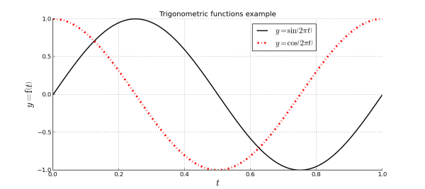
In the image you can see the result that we will approximately obtain. Following this tutorial you will learn:
- How to create a Plot from the Python console.
- How to plot some data from the Python console.
- How to show the
grid lines.
- How to show the
legend.
- How to edit
series labels, introducing text in LaTeX.
- How to edit
axes labels, introducing text in LaTeX.
- How to edit series styles.
- How to save your plot.
Plotting data
To plot data you don't need a LabRPS document, simply open the Python console and start sending commands, or use macros.
Creating plot document
Plots are special documents that can be created manually in order to add data later, or the workbench can create one automatically when you start plotting data. Creating your own plot document has two advantages:
- You can set the document window label.
- You can control the document where you plot your data.
To create a new plot document simply launch the following commands:
try:
    from LabRPS.Plot import Plot
except ImportError:
    from freecad.plot import Plot

Plot.figure("TrigonometricTest")
In LabRPS version 0.19 it is required to install the Plot Workbench with the Add-on manager, while from LabRPS version 0.20 onward the external add-on is no longer required to perform plots.
The commands above will create a new tab in the Main view area called TrigonometricTest. The newly created document already has a set of axes. Each plot document has at least one set of axes.
Drawing functions
You can also start working from here because, as already explained, the plot command will create a new document if required. The next thing we need to do is create the data for the sine and cosine functions that we want to plot:
import math
t = range(0,101)
t = [tt/100.0 for tt in t]
s = [math.sin(2.0*math.pi*tt) for tt in t]
c = [math.cos(2.0*math.pi*tt) for tt in t]
That will create 3 arrays of data (with 101 points):
- t = Time in seconds.
- s = Sine function.
- c = Cosine function.
In order to plot both functions we only need to launch the next commands:
Plot.plot(t,s)
Plot.plot(t,c)
The plot command allows the series label as an argument, but since we will edit it later using the Plot workbench tools, we don't pass this data yet.
Configuring plot
Showing grid and legend
Change the LabRPS workbench to the Plot Workbench with View → Workbench → Plot (you must install the add-on first with the Add-on manager). When the workbench has been loaded, use the grid tool to show the grid.
Show/hide grid tool icon
You can repeat the action to hide the grid. Use the legend tool to show, or hide, the legend.
Show/hide legend tool icon
As you can see, the legend is very small and empty because we have not set any series label yet. In the Plot Workbench series without a label are not displayed in the legend.
Setting series label
With the series tool you can edit the parameters of each series.
Series configuration tool icon
Select the series you want to edit, we will start with the first one. Uncheck No label and set this label:
$y = \sin \left( 2 \pi t \right)$
Since matplotlib supports LaTeX you can set all labels and titles using LaTeX. Set the following label for the second series:
$y = \cos \left( 2 \pi t \right)$
Setting series style
You can set many series properties. Try to set the properties shown in the example image, changing the colors and drawing style of the second series.
Setting axes labels
With the labels tool you can set the title and the labels for the axes.
Labels tool icon
Set this data:
- Title = Trigonometric functions example
- X Label = $t$
- Y Label = $y = \mathrm{f} \left( t \right)$
Also change the font size of the title and all labels to 20.
Saving plot
With the save tool you can save your plot as an image file in several formats.
Save tool icon
First select the path and filename for the output file.
Set the output image size in inches, for example use 11.7x8.3 to get a DIN A4 size. DPI (Dots per inch) will control the image resolution, for example use 100 dpi. In combination with the given dimensions this will result in an image of 1170x830 pixels.
- Getting started
- Installation: Download, Windows, Linux, Mac, Additional components, AppImage
- Basics: About LabRPS, Interface, RPS Objects, Object name, Preferences, Workbenches, Document structure, Properties, Help LabRPS, Donate
- Help: Tutorials, Video tutorials
- Workbenches: Std Base, WindLab, SeismicLab, SeaLab, UserLab, Spreadsheet, Plot, Web
- Hubs: User hub, Power users hub, Developer hub

